
What you need to know about logos...
- Julie Boake

- Aug 9, 2021
- 3 min read
Updated: Sep 15, 2023
I've seen it, we have all wanted logos that look like the latest trend, of course, we do, that's human nature.
BUT THAT'S WRONG!
When working with a designer, you will notice, many have a 'style' that us uniquely theirs, but if you see a designer following all of the trends in their designs, you will likely end up with a logo 'of the now' rather than one that will stand the test of time.
So what should you be considering when designing a logo?
The look:
1. It should not look like the now. ie: circle logos or triangle-shaped logos seem to be 'all the rage' right now, but as a tattoo, in a few years it will look like 2017/2018, not timeless. While you may love it, if it does not completely make sense, or hold some timeless value, it will likely be revamped in a few years as you want to embrace the next trend.
2. Color: teal has come in and out, yet there are a lot of logos that were designed with it a couple of years ago... and ... some may or may not regret that color choice. Pick a color that YOU love, that makes sense for your business, it may not be popular, but you will love it a lot longer (orange is people's least favorite color, yet I still love it)
3. It should work well without color, yes, your logo should make sense even in black and white (or gray scale) if it doesnt, its going to be a hot mess in some ads when color is not an option.
4. Hello gradients. This effect has come and gone, come and gone. Anyone that has used gradient in their logo knows it can be a nightmare sometimes, you know how challenging it is to stitch that? It can be a challenge, or not make sense in a single color (again, black and white) ads.
The Use:
1. You can have two logos, seriously, if you build a brand. If you have not built a brand or style guide, two logos may not make sense as much as when you have built a style guide. Style guides show you how to use a secondary logo for alternative platforms (social media) because you have also designed a consistency, letting people know that it's still your business.
2. Consider whether you need a 'watermark' to overlay on images (again, single color).
3. Breaking it. No I don't mean actually breaking it, but there are times when you will want the icon, versus the icon+type/name. Consider how you will keep that tie-in together.
4. Are there other elements that need to be incorporated (ie boxes, circles, enlargements) these all help tie it all together.
5. Color uses: What is your main color and what are the complimentary colors. Do they have a hierarchy of use?
Why is it important?
1. Building a brand around a style guide helps the perceived value and actual value of your business (this falls into the 'goodwill' section).
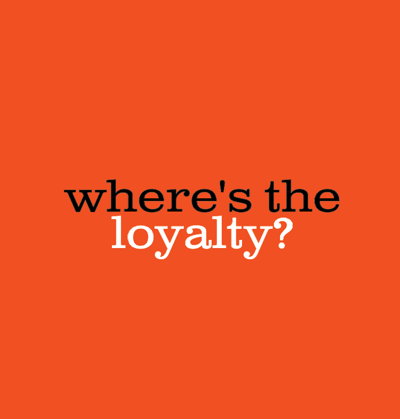
2. Having a strong brand creates loyalty and familiarity (which builds trust) in your business. Some say, a strong brand opens doors, I believe it opens them and keeps them open.
3. People who love brands are happy to be advocates for it. People are more willing to wear the gear, put the sticker on their vehicle and even refer a business and brand they feel represents themselves well.
There is so much to learn about logos and branding... this is just the start. If you are considering a new business or rebranding, please feel free to contact me.
Julie Boake
awedity creative
403.560.6554


Comments